1084 results found
-
Add support to Motion (Player) Highcharts Plugin in Angular
It would be great if there is a kind of wrapper for Motion (Player) Highcharts Plugin in Angular 4.
4 votes -
Official Vue.js Wrapper
Hi, It's excited to hear that you are created Highcharts official React, Angular wrapper, and do you have any plan to create Vue.js Wrapper ?
more information about Vue.js
Official Website: https://www.vuejs.com
vue Highcharts wrapper : https://github.com/weizhenye/vue-highchart12 votesThanks for your request! Currently we don’t have a plan for a Vue wrapper, but we will consider this if the demand is high.
-
Android Native client
Hello Team,
Any plan to support native client for high charts? if you have any plan, please let us know as we are looking for the native android client for charts.11 votes -
Apply negative fill color if area range values are crossed
The original area range plot:
https://drive.google.com/open?id=0BxTJinjfcZ1uaTZJQVRoSkY0WEEApplied negative fill color in the crossed area:
https://drive.google.com/open?id=0BxTJinjfcZ1uZ1VlOEZxWDBLb0E12 votesThanks for your suggestion!
-
Status Timeline Charts
Single or multi series, they look like stacked bars (and they may have gaps), but they may repeat the same colors in the same timeline. Hard to repro with other types of charts (like Gantt).
References:
https://forum.highcharts.com/highcharts-usage/bar-chart-with-repeating-colors-t39445/
https://www.interworks.com/blog/ccapitula/2014/12/18/tableau-essentials-chart-types-gantt-chart
https://docs.inductiveautomation.com/display/DOC/Status+Chart
https://stackoverflow.com/questions/23223059/wpf-toolkit-stacked100barseries-chart
https://stackoverflow.com/questions/22191515/how-do-i-create-a-timeline-chart-in-excel
https://github.com/jiahuang/d3-timeline18 votes -
Add "Xaisomboun Province" to Laos map in Highmaps
Hi,
I would like to add "Xaisomboun Province" refer to this https://en.wikipedia.org/wiki/Provinces_of_Laos, because "Xaisomboun Province" next to "Vientiane Province" is missing from the original map in Highcharts demo. Here: https://www.highcharts.com/maps/demo/all-maps#countries/la/la-all
How can i update this in the original official JS file. Here: https://code.highcharts.com/mapdata/countries/la/la-all.js
I try to use this tool https://www.highcharts.com/studies/map-from-svg.htm but it does not output data format like in the original javascript file above.
Best Regards,
Phouvanh1 vote -
highcharts area range and line with gradient
I would like to have a gradient fill for area range graphs where the color starts at the center of the area and then fades to the secodn color at the edge of the range.
Similar to this question on stackoverflow: https://stackoverflow.com/questions/14781214/highchart-area-range-chart-with-gradient-that-follows-the-line#
6 votes -
hoverable tooltips for axes plot lines
In our application, I have created tooltips for plot lines by dynamically modifying the chart configuration when the plot line is hovered over. I think it would be useful to provide this option as a configuration setting, or highcharts plugin to enable this.
Example JS fiddle: http://jsfiddle.net/tw6rmc1r/2/
10 votes -
Surface Pyramid Chart
Originally described here: https://forum.highcharts.com/highcharts-usage/surface-pyramid-chart-t39503/
What you have is just a Linear Pyramid: http://jsfiddle.net/cristiscu/sbt6bbfh/6/. Top segment's height is 15% of the full pyramid height.
Surface Pyramid: http://jsfiddle.net/cristiscu/sbt6bbfh/7/. The only change was in the pyramidMode value. Top segment's area was made bigger, to show 15% of the whole pyramid surface.
Reference:
pyramidMode (Syncfusion ejChart): https://help.syncfusion.com/api/js/ejchart#members:commonseriesoptions-pyramidmode
valueRepresents (amCharts): https://docs.amcharts.com/3/javascriptcharts/AmFunnelChart
PyramidValueType (Microsoft ASP.NET Chart): https://msdn.microsoft.com/en-us/library/dd456634.aspx9 votesThanks for your suggestion! This is probably equivalent to the bubble sizeBy option, which sets whether the bubble’s value should be expressed by its area or its diameter.
http://api.highcharts.com/highcharts/plotOptions.bubble.sizeBy
-
To add Filter Option on Categories.(We can hide whole categories by selecting categories from multi select drop-down )
In Stacked column chart, Consider,
I have 3 main categories, i.e. Product1, Product2, Product3..
Each Product has 2 sub categories i.e. Open Bugs, Resolved Bugs..
Bugs are raised by Robert and David are the our Legends..
Now..I am suggesting to provide an option Like drop - down (May be multi select) which will contain all sub categories i.e. Open Bugs and Resolved Bugs..
So if user selects any one of them..charts will display all data for that selected value..in above example if user selects Open Bugs option the all product will hide data related to Resolved bugs and will show…
14 votes -
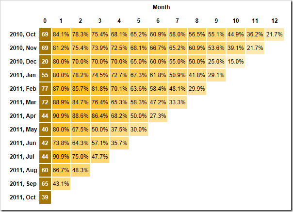
Graph of Cohort Analysis
What is Cohort Analysis - https://en.wikipedia.org/wiki/Cohort_analysis
Example Graph of Cohort Analysis - http://blogs.thesitedoctor.co.uk/tim/images/How-to-read-and-interpret-a-Cohort-Trian_FC17/Cohort-Created-To-Last-Purchse3.png
21 votes -
Collision Detection for Data Labels
Implement collision detection algorithm that repositions overlapping data labels, with possible input parameters dictating a proportional distance to move labels away from each other, or directionality indicators.
175 votes -
Plot Band can be divided into sub Band
Plot Band can be divided into sub Band. If this feature is provide then it will be easy to define Sub band in a plot band. Just like a stack bar diagaram
1 voteDo you mean that a plot band on the X axis can be limited to a certain Y range?
A possible hack to achieve this would be to use a polygon series: http://jsfiddle.net/highcharts/2c97sc5r/
-
Position tick labels between ticks on a date-time x-axis
In a chart with data plotted on and datetime x-axia i would like to position tick labels between ticks rather than on ticks. An when i zoom they still appear in the center to the right of it's tick.
for example i have a tick on August 1st and another on September 1st and my date formate is MMM. I would like to see 'Aug' centered between the August 1st tick and the September 1st tick
7 votesThis would definately be a nice feature. I believe we would need two types of label placement on datetime axes. Interval labels would be placed between ticks. For example a month name. But if the interval spans two months, like August-September, the label would have to be placed on the 1st of August.
-
Bubble chart- Data label positioning at the bottom
As of now, If the bubble is near the x-axis, by default the data label is positioned on top of the bubble. Our requirement is to align within the plot area (above the x-axis) either to the left or right of the bubble.
Thanks In Advance
3 votes -
Provide support for creating HighCharts using Web Worker
Sometimes, creating and rendering charts hampers the performance of application. So, it is a smart idea to create and render chart using the web worker. For details visit: http://forum.highcharts.com/highstock-usage/does-highstock-library-work-with-web-worker-t35660/
239 votes -
xAxis tick labels overlapping handling
Hi,
Now we have automatic xAxis labels rotation or overlapping handling.
But1.When I generate xAxis labels by myself with tickPositions - then auto-positioning(overlap handling) is not working. Can you make labels autopositioning work for custom tickPositions please?
- One more approach - if custom labels overlap - then show '...'(or some other filler) but show full labels on zoom In.
1 vote -
Hiding empty columns
If you hide all bars in a column that is in the center of things, it will not be hidden currently. I suggest that this is made possible.
7 votes -
Support 3d line charts with multiple series
At the moment there is no support for 3d line charts with multiple series. Something like this
https://habrastorage.org/getpro/habr/post_images/c82/1f8/8fe/c821f88fe784e852dab621227f2d1c52.png7 votesThanks for writing. It would be like http://jsfiddle.net/gh/get/library/pure/highcharts/highcharts/tree/samples/highcharts/3d/column-grouping/, except with a line chart instead of column.
-
Include CSS for each example theme like grid.css
The CSS for each of the existing example themes should become part of the product download. Please see this forum post: https://forum.highcharts.com/post135634.html#p135634 t
1 vote
- Don't see your idea?