402 results found
-
clustered stack bar chart
I'm looking for this new feature
9 votesThis feature was completed as of 2.1. See http://highcharts.com/demo/?example=column-stacked-and-grouped&theme=default.
-
3 votes
Use a subtitle. See http://jsfiddle.net/sGv32/5/.
-
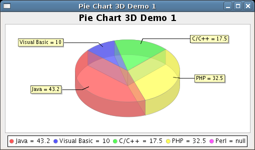
3D charts
Add new 3D style pie and bar charts, like http://www.jfree.org/jfreechart/images/PieChart3DDemo1.png
1,235 votesFinished as of Highcharts 4: http://www.highcharts.com/docs/chart-concepts/3d-charts/
-
Implement Shadow Options (Color, Size)
This would allow us to control how the shadows look like, similar to photoshop drop shadow options.
178 votes -
legend title
I've searched the forum and docs and not found an answer
Would be nice if we could set a legend title. Our users are beginners at reading graphs and every little bit helps.33 votesImplemented as of Highcharts 3.0.
-
link example options to jsfiddle.net
jsfiddle is brilliant and I'm glad you linked each of the API references to it. Can you link each of the demo examples so they can be loaded directly into jsfiddle?
0 votes -
Support chart zooming for iPad
Zooming functionality via mouseclick->drag (including the master-detail charts) are not currently supported for iOS devices. Possible to implement this via doubletap->drag, or incorporate the iOS pinch action?
7 votesAdded in version 2.1
-
hh
First of all - sorry for my terrible English! :)
http://www.danvk.org/dygraphs/ - good examle - multiply y-values visible (tooltips) - and one time (x-value). With line (ray)? like in this example - http://jsfiddle.net/YNS2f/188/ - it will be great for industry automatisation systems (like trendsin SCADA i mean). And if this multy-tooltip will be printable ("freezing" on mouse click, and then user can click print button) - it wiil be superb!3 votes -
Create Prototype Adapter
There is a third party prototype adapter at http://github.com/mnelson/Prototype-Highcharts-Adapter . It would be great to have this merged into Highcharts and officially supported, since new releases can break it.
7 votes -
annotate plot bands
annotate plot bands.
Ways I can think to do this are:
- place text aligned within the plot band (centered, or on the line)
- create a axis like object with extruding labels that connect to each plot band
13 votesAdded in version 2.1
-
Add options for the placement of the data labels in pie charts
Options for the placement of the data labels in pies, such as connector lines pointing back to the slice. I've found a forum thread talking about this here : http://highslide.com/forum/viewtopic.php?f=9&t=5865&p=27996
8 votesAdded in version 2.1
-
Create Guide Line Option That Follows Mouse
It would be nice if the charts support having a guide line that follows the mouse cursor, similiar to Campaign Monitor. Also the ability to make it dashed would be great. Currently I could plot a line manually but it does not work currently with alternating row colors.
Something like:
HoverGuide: 1 >>> etc.0 votes -
Persist the tooltip when data plots are not expected to move on chart refreshes (ie. fixed scales)
When a chart's scales are fixed, preventing the data points from moving on dynamic updates, the tooltip balloon should persist for as long as the mouse cursor is hovering above a data point or the scales change.
9 votes -
Support radial gradients
This would be most useful on pie charts to enable a 3D look.
81 votesImplemented as of Highcharts 2.3
-
Drill Down Charts
There should be drill down facility charts. If I have a pie chart in which I have two data "Desktop" and "Mobile". If I click on "Mobile" part in pie chart it should redirect to column graph or bar graph (whichever i specify) and list ll the mobile device I had used.
167 votesDrill down charts are natively supported since 3.0.7
-
Display the tooltip no matter where the mouse is on the chart
As of today, Highcharts library requires you to mouse over a specific point to show the tooltip. It should also be possible to display the tooltip no matter where the mouse is on the chart. This solution can be found on different Google charts as well as http://www.campaignmonitor.com.
12 votesAdded tooltip.shared option in version 2.1
-
Google-style Pie Chart Labels
Sometimes the pie chart labels cannot be displayed, or are difficult to understand when the pie pieces are thin. Google's chart API (http://code.google.com/apis/chart/docs/gallery/pie_charts.html) places the labels outside of the chart with lines denoting pie pieces.
21 votesImplemented as of version 2.1
-
630 votes
Treemaps is currently under development, but here is a small taste of what you can expect in the future.
At the moment there is four algorithms implemented to get users up and running quickly. These are the SliceAndDice, Stripes, Squarified, and Strip algorithm. By extending the series object, the users can also add their own algorithms for layouting the data.
A levels object is introduced to let the users set wanted options to a specific level, this is displayed in some of the demos. The levels object is great for using a mix of several algorithms in the same chart.Demos:
- http://jsfiddle.net/highcharts/sqxqq1ry/
- http://jsfiddle.net/highcharts/pa1eoqps/
- http://jsfiddle.net/highcharts/tm720ufm/ -
Fix spline plots to draw a better generalized line.
Current spline plots can be unintuitive when your dataset isn't quite a perfect curve. A dataset of 10,10,10,0 shows a huge spike in the line right when it really shouldn't exist.
24 votesVersion 2.1 released
-
Allow for axis labels to act as links
I would like for you to able able to specify a link URL for each label on an axis. This would allow for people to click on the label to learn more.
5 votesSee docs for axis.labels.formatter
- Don't see your idea?