1084 results found
-
3 votes
-
mark type 'x' and '+'
like this http://jpgraph.net/download/manuals/classref/PlotMark.html all types of mark
3 votesYou can add that as a plugin without altering the source code. See http://jsfiddle.net/highcharts/bz2pd/.
-
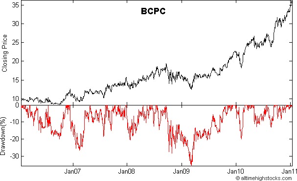
Add drawdown line (including calculation)
When assesing alogrithmic stock exchange strategies a common factor to look at is the drawdown. This is the line which calculates worst case scenarios. See an example here (the line below): http://1.bp.blogspot.com/_BfLmdGI0L-U/TTM1v0-cBMI/AAAAAAAAAgQ/5x_T8pmcCZE/s1600/BCPC-Balchem-Corp-NASDAQ-Drawdown-Stock-Chart_20110116T131301.bmp
3 votes -
Set background image for tooltips/flags and so on
Set background image for tooltips/flags and so on.
11 votes -
is there a possibility to integrate highchart with jsf2,primefaces
highchart jsf2 primefaces
6 votes -
pure JS graph export
We run on app engine and it doesn't play nicely with the current chart export...
5 votes -
legend item auto width
to calculate the options.itemWidth for legend items to the maximum width of the legend items. i can send you my version but i think you could do it better ;)
thx6 votes -
Conditional Colors Minimum Maximum
Example: 20 shops with the same 20 products, 3D bar charts, lowest price per product green, highest price per product red, others default color, e.g. grey
Result: which shops have lowest prices.
It should be possible that minimum and maximum can have a range (e.g. +- 3 %) to have the green or red color.
1 vote -
add an 'above' y-axis title align option
A standard way of displaying the title of a vertical axis is horizontally above the axis labels (see http://dl.dropbox.com/u/2179993/axis_top_chart.png). The only way to achieve this currently with Highcharts is to rotate the title and manually position the it using the 'margin', 'x', and 'y' axis title properties. It would be useful if this positioning could be calculated internally, and specified by an additional option to the 'align' property.
12 votes -
ability to have different marker images/symbols for default and on hover states
ability to have different marker images/symbols for default and on hover states
6 votes -
5 votes
-
sparklines
Create sparklines like in Google analytics
19 votes -
Custom placement for x and y axis labels
Customize/replace the placement of the x and y axis labels.
Example:
AxisXCustomLabels = [{value: 1, label:'label1'}, {value:4, label:'label2'}, {value:54.4, 'label5'}]4 votes -
Cursor X Value and Event
Using a cursor line following the mouse, not points, would be very useful know current cursor value (X axis value) to allow us to interpolate Y values and a way to set a JS method that will be fired on cursor move.
Is very common a table with the columns (Timestamp and Value), but in some analisys, is very useful "see" the value between 2 points. The value between this 2 points doesn't exist on dataset, but can be interpolated. With the current X value of cursor and a event will allow us to develop a JS interpolation method.15 votes -
Under the lang options provide an option to specify the length of the month abbreviation.
French abbreviate their month names to 4 letters not 3. With only three June and July both abbreviate to "Jui". I think the easiest solution would be to provide an option that we can set under "lang" that specifies how a long a substring to take when abbreviating month names.
1 vote -
3 votes
-
Add Market Hours Bars
An excellent feature would be to show the open times of the different world markets accross the bottom of the chart. For example when NY is open and Hong Kong, London etc. Here is an example: http://goldsilver.com/gold-charts/
1 vote -
Feature of combining/nested the graphs.
Feature of combining the graphs. something like http://www.rgraph.net/docs/combine.html. kind of nested graphs
1 vote -
api hook for missing data
An option for what to display in place of missing data. Currently, you can override the formatter for data labels, a simple '==null' test would work. The issue is that the formatter and display for the label is skipped on null elements in series. Could there be a second option, an incase-of-null display hook?
0 votesThank you for your request.
-
Auto rotate X-axis label on column chart
In a column chart, it looks fine with the x-axis label rotation of 315 when the bars are closed together. However, when the bars are sparse, then it looks too spacious and unnecessary. The trouble is I don't know how many data points in advance. I would like a new feature with autoRotation: 315 for the axis label.
12 votes
- Don't see your idea?