1084 results found
-
YTD
I use Highcharts for my mutual fund company's website and it works great. However, as we only update our performance for the funds once a month the YTD as of starting 2012 is not working anymore since the values in the dataset only stretches to the end of 2011.
It would be great if you could enable a feature for YTD to only strech to the last date in the dataset. Most other funds do not update their performance (regarding their charts) more than weekly/monthly either so I am confident this will disable many fund companies from using high charts.
6 votes -
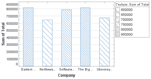
Color blind readability.
Support background textures on solid color UI elements like Pie and Bar charts.
Ideal solution would be angled lines in the charts for example http://www.inetsoft.com/images/screenshots/controlling_texture_in_a_bar_chart.gif
27 votes -
Allow users to hit Enter to change date/time range
Currently in Highstock, if you're editing the date/time range by using the text fields, you can't hit Enter to make your changes, which is odd. Instead, you have to click the page outside of the text field. Support for hitting Enter should be added.
0 votesWe currently use the input box’s onchange event. Turns out that Chrome and Firefox already trigger the event on Enter. IE8 however fails to change the ranges on Enter.
-
Implement the ability to add tooltips to Charts labels
Implement the ability to add tooltips to Charts labels
1 vote -
error reporting
Highcharts really needs better error reporting. For example, when I tried to call
new Highcharts.Chart(), I get the error "TypeError: Cannot set property 'innerHTML' of undefined". Really, I should get something like, "Missing required argument: options" or something descriptive like that. Right now I'm trying to debug this error from Highcharts: "Uncaught TypeError: Cannot read property 'length' of undefined".These problems make it seem like Highcharts is full of bugs. Instead, I'm sure I'm just using it incorrectly. The error messages should help educate me on what I'm doing wrong so I can quickly correct it.
6 votes -
Allow specification of indices for series from one data array
I have data that is 10's of thousands of points per chart, so the named value pair form of the chart won't work. So I'd like to request a new feature. Where you let me use 1 or 2 indexes into the point data to define a series, but allow me to access all of the data from the tooltip. So for a line chart I would define the series by the array name, and 1 index and for a scatter chart I would define the series by the array name and 2 indices. But the this.point would refer to…
1 voteI’m not sure I get you, but perhaps you can solve your task by using parallel arrays? http://jsfiddle.net/highcharts/uBVzY/
-
"Inverse" step line option
Current step line chart plots the horizontal line first, then the vertical. "Inverse" option would result in the vertical line plotted first, followed by the vertical.
10 votes -
Graph Replay User Interface
I know the current Highcharts support animation when updating series data. However, I think Highcharts would be really useful if it can provide a way to play, replay, step forward, step backwards kind of interface.
Let say I have a time series chart, then I have configured the chart to only display 10 data points with spline. Then load the series of data containing 100 data points. When user clicks play, it will play through the data trend.
Same thing can apply to bar and pie charts. But ultimately, I think the most interesting one is using with Heatmap.
4 votes -
5 votes
-
Theme option in chart options or constructor
Theme being a global object (Highcharts.theme = {...}) is quite limiting - we have some cases where we want to have multiple charts on 1 page but with different themes.
To do that now we have to intersperse all the theming options with the rest of the options, which works, but is somewhat clunky. Or we can set the theme, render 1, set the theme, render another and hope there are no redraws required.
This suggestion is about adding a theme argument either to the highcharts options object, or to the constructor. eg:
new Highcharts.chart({
theme: {...},
chart: {...},
series:…3 votesThe theme actually isn’t part of the Highcharts namespace internally, it is just assigned there for conveniency.
Best practice currently would be to merge in the theme with your chart options:
chart1 = new Highcharts.Chart(Highcharts.merge(options1, theme1));
-
Any chance of summarised data in a drill down tree view?
Excellent product by the way.
2 votes -
associate rangeSelector with a specific xAxis (in Stock)
Allow the rangeSelector options to be associated with a specific xAxis for the Stock product.
If more than one xAxis is present the rangeSelector does not seem to work. I would like to tie it to the xAxis used for the navigator.
1 vote -
Allow stacking on different types of series
So, we have 2 columns series and 2 scatter series and all these 4 are pointing to a single category item.
Occasionally, there is a need to show stacked points scaling together with the transforming columns whenever we show or hide column series belong to a single category point.
Unfortunately, currently even if we stack column 1 and scatter 1 & column 2 and scatter 2, the scatter points are staying on the exact same spot whereas the columns are transforming during show and hide.the only thing necessary is to adjust the "x" value of the scatter points to…
7 votesI created a plugin to allow the scatter points to align to a column series. See http://www.highcharts.com/jsbin/omevud/edit .
-
Allow styling of "reset zoom" link
Users often overlook the link and cannot reset the zoom level.
17 votes -
3 votes
-
Pie chart backgroundColor
Add possibility to give the piechart itself a backgroundColor. So only the circle area.
1 vote -
worldmap
once in a while you want to know which part of theorld vist your site, or maybe its a you wamt to generate stats based on a question you askec your user
1 vote -
Trigger event when hover the mouse over the chart.
Trigger an event with X,Y.. when hovering the mouse over the chart.
2 votes -
2 votes
-
Bar w/ Neg stack from opposite ends of Y-axis
Same as Bar with negative stack but instead of data points starting out from the center and going outwards towards the left Y-axis and right Y-axis, have data start from the left and right Y-axis but moving towards the center (with an arrow for each bar)
3 votes
- Don't see your idea?