- or
1083 results found
-
tickmarkPlacement for xAxis set as datetime not categories
What I am after is to do exactly what the tickmarkPlacement:'between' setting does for categories. Except I need it for dates. This is a pretty fundamental charting option that should be available.
If I'm doing a chart that is over 12 months and I'm showing the months on the xAxis, I want the labels to be in between the ticks as that represents the month not on the tick that separates one month from the next.
If there is a way of doing this I would love to know. I can't use the label x setting as the charts are dynamic and updating daily.
What I am after is to do exactly what the tickmarkPlacement:'between' setting does for categories. Except I need it for dates. This is a pretty fundamental charting option that should be available.
If I'm doing a chart that is over 12 months and I'm showing the months on the xAxis, I want the labels to be in between the ticks as that represents the month not on the tick that separates one month from the next.
If there is a way of doing this I would love to know. I can't use the label x setting as the charts are…
21 votes -
Graph of Cohort Analysis
What is Cohort Analysis - https://en.wikipedia.org/wiki/Cohort_analysis
Example Graph of Cohort Analysis - http://blogs.thesitedoctor.co.uk/tim/images/How-to-read-and-interpret-a-Cohort-Trian_FC17/Cohort-Created-To-Last-Purchse3.png
21 votes -
Add Renko chart type to the charting cabability, here is a link for charting Renko
Create highstock renko chart type. https://stockcharts.com/school/doku.php?id=chart_school:chart_analysis:renko
21 votes -
Add paging to column charts
if the list of columns are to big to display, I would like a way to paginate them and show the columns in groups of 10, 20, etc.
20 votes -
Heatmap highlight row/column of a given category
The user would click a given category name, for instance, on a list, and the heatmap would highlight the row/column that corresponds to that category. This would allow for users to look for columns/rows if interest in a faster way, especially when dealing with big datasets.
20 votes -
Limit the number of items per line in legend
I've created javascript functions to automate some char creations.
I may not know what the names of my series will be, nor their length, but I know how I want to organize them in my legend (2x3, 2x2, ...).
It would be great if we could set in the legend's options the number max of items per line.
20 votes -
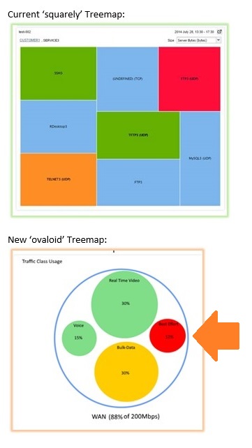
Circular Treemap charts
Instead of having Treemap as groups of rectangles, we can have it as group of circles.
Something like this:
- http://coolmoviebrowser.free.fr/img/circular-treemap.jpg
- http://www.addictivetips.com/windows-tips/analyze-disk-space-usage-via-7-tree-based-data-structure-visualization-treeviz/Hope you can do it :)
Regards,
Sorinel20 votes -
sparklines
Create sparklines like in Google analytics
19 votes -
Wordpress Plugin
A plugin where one can upload a CSV file and in turn it creates a graph of its own, like a page.
19 votes -
Explicit support for drill-down Ajax interactive data zooming
I have an extremely large dataset (once-a-second measurements extending over several years) that I'd like to be able to zoom in (and out) interactively with the Highstock navigator as well as direct selection with the mouse.
I think I have finally managed to piece together a somewhat stable solution by using the rather under-documented setExtremes event. However, some slight instabilities remain, mainly due to the fact that the setData method appears to itself trigger the setExtremes event sometimes. In addition, my dataset is discontiguous (has many gaps) and Highchart seems to like to shrink the limits of the selected data range to exclude gaps surrounding the data, which also ends up triggering setExtremes again.
So, since such interactive Ajax behavior seems to still be in the experimental phase, I'd like to cast my vote for it becoming an official feature.
Based on my experience working with the tool over the last couple days, I've arrived at the following approach which could work so much better if Highcharts somehow better supported this, probably through explicit events tailored to dynamically populating data interactively.
- My external server-side script has two distinct modes-
(a) give me all the data, averaged by hour. This gives me on the order of 10,000 points, which is very doable to work with to populate the navigator series and provide interactivity with a good range of zoom levels.
(b) give me a date range of data in full, down to the second. This I use for data ranges less than 24 hours long, This gives me no more than 86,400 points, which is doable especially because the user is expecting a delay (and I show the "loading" display).
My client-side Javascript, which uses Highstock, initially reads in all the data by hour and explicitly populates the navigator with it, as well as the main chart.
I hook into the setExtremes event of the xAxis, and if the selected date range is 24 hours or less, I retrieve just that data and use setData to apply it to the series of the main chart. If the selected date range is greater than 24 hours, I simply setData back to the original full series, which is still in memory and in use by the navigator.
The problems are mainly that the setExtremes event tends to get triggered multiple times per user interaction, particularly when the navigator is manipulated by the user. So, I have to put in an explicit test to make sure that the min and max passed directly in the event object are in fact different than the current min and max, which I obtain from the currentTarget property of the event object. If I don't test for it, an endless loop often occurs because it appears that in some cases the setData method can trigger a setExtremes event itself.
In addition, as I mentioned, the system seems to like to shrink the gaps between the data and the start of the date range, which can be disconcerting because, when zooming in on a particular "island" of data, it is useful to see the gaps so that you know you have all the data from that island in view, and that the edge didn't get chopped off.
So, I think one approach to this could be the creation of a "getData" event, which would be triggered whenever the display range of the chart is changed - after the system has completely settled on exactly what the new range will be, but before it has attempted to update the display. This event would be triggered regardless of the source of the display change, whether it is programmatic, or through user manipulation of the navigator or direct selection of a subrange on the chart by click and drag.
The event would be passed the exact date range (or more generally the xAxis range) that it intends to display. The user handler could choose to do nothing (the default), in which case the existing series data would be displayed. Or, the handler could fetch new data into one or more series' data range(s). The Highchart system would then, upon completion of the getData event, display exactly the xAxis data range it had passed to the getData event, possibly adjusting the yAxis to conform to the new data depending on settings related to yAxis behavior.
This event, in my vision of things, would not have the ability to change the xAxis range that is to be displayed, nor could the system "change its mind" and make adjustments to the range being displayed after the getData event is triggered. This is important because the user will then experience a stable environment in which what they select with the mouse is what they get, no matter what the data looks like, or what gaps are in it.
From my testing, no event exists that satisfies this criteria. The redraw event comes close, but it is not always consistently triggered, particularly when the Highstock navigator is used. The setExtremes event comes closer, but it exhibits the instabilities I have discussed, that I had to work around. setExtremes appears to be triggered too "early" in the process, so to speak.
If there is a way to accomplish exactly what I have proposed using existing features of Highchart/Highstock, please enlighten me. Otherwise, my feature request is respectfully submitted.
Thanks!
[note: I have at least one other request that is related but I will submit separately.]
I have an extremely large dataset (once-a-second measurements extending over several years) that I'd like to be able to zoom in (and out) interactively with the Highstock navigator as well as direct selection with the mouse.
I think I have finally managed to piece together a somewhat stable solution by using the rather under-documented setExtremes event. However, some slight instabilities remain, mainly due to the fact that the setData method appears to itself trigger the setExtremes event sometimes. In addition, my dataset is discontiguous (has many gaps) and Highchart seems to like to shrink the limits of the selected data…
19 votes -
highlight axis when passing over series
When a chart have several axis it is not easy to see which axis has to be used with a serie.
A solution migth be to higlight (like columns) axis when the mouse passed over a serie
19 votes -
Support extending step lines to the edge of the chart
Currently, on a chart with multiple series having distinct x values, step lines can look awkward when one series ends before another.
My immediate desire is simply to have an option to extend step lines to the right-hand edge of the chart. It should work when addPoint() is used on another series and the chart is redrawn. That is, all series drawn with the "step" option should be drawn as-if they have an additional point like [chartmaxx, serieslasty].
I don't need full extrapolation capabilities, that is, I'm not asking for any logic to decide how to draw points that might occur in the future. This is merely a presentation issue, so that step lines may be treated as having the last value until the next one arrives.
This was mentioned in a comment on another request, but have a strong desire for the feature and want to make it official. For reference, see Mark Crossley's comment from December 2012 here:
http://highcharts.uservoice.com/forums/55896-general/suggestions/3311322-step-position-on-between-Currently, on a chart with multiple series having distinct x values, step lines can look awkward when one series ends before another.
My immediate desire is simply to have an option to extend step lines to the right-hand edge of the chart. It should work when addPoint() is used on another series and the chart is redrawn. That is, all series drawn with the "step" option should be drawn as-if they have an additional point like [chartmaxx, serieslasty].
I don't need full extrapolation capabilities, that is, I'm not asking for any logic to decide how to…
19 votes -
Linear gauge
Would love to have linear gauges like this:
http://www.russell.com/Helping-Advisors/Markets/EconomicIndicatorsDashboard.aspx
19 votesYou can create linear gauges from columns or scatter charts with one single data value: http://jsfiddle.net/highcharts/9ybLv5je/.
Other examples:
- Filler gauge: http://jsfiddle.net/highcharts/amfbptkw/
- Marker gauge: http://jsfiddle.net/highcharts/7mcq4az6/
- Thermometer gauge: http://jsfiddle.net/highcharts/Y7F3F/
-
add more html tag support
We're trying to add some superscripted text to chart subtitles, but the <sup> tag is not supported. Can you add support for some more html tag support for tags like <sup> and <sub>
19 votes -
Allow chart to determine/set auto-height/width.
See here: http://forum.highcharts.com/post115029.html
This would add a chart width/height setting of "auto". For bar charts, the auto height uses the point width and padding options to determine the "correct" height of the plot box, instead of using the size of the container. For column charts, the chart would grow/shrink horizontally to fit all columns.
19 votesWe experimented with this in http://jsfiddle.net/gh/get/jquery/3.1.1/highcharts/highcharts/tree/samples/highcharts/studies/axis-staticscale/
-
19 votes
It’s a good idea, Iit would require that we either are able to send images directly from the browser memory to the social media APIs, or that the export server passes the images to the APIs.
-
Static image rendering for performance
The dynamic SVG plots could be replaced by a static image of the plots, similar to how the exported PNG looks. The choice between dynamic and static could be made at runtime based on the size of the dataset.
I'm generating scatter plots based on data from a database. The plots looks great, however the performance gets to be a probably when the plot has more than 1000 points.
18 votes -
Averages (mean/median/mode)
Include average information with each chart. This could include mean, median, and mode.
18 votes -
Support "dblclick" event
Please support "dblclick" event for chart, series, and point.
18 votes -
Enable/disable resizing of bottom navigator
Currently, handles exist for expanding or contracting the date range. I would like the ability to remove the handles so the user can only scroll left and right without being able to zoom.
18 votes
- Don't see your idea?