1084 results found
-
Sort the legend
Right now it looks alphabetical in the legend even though the data shows by yAxis in the graph. Sorting would help with turning plots on or off.
28 votes -
Step line that draws leading or following part
Currently, I can use a step line to draw non-continuous data. However, the rendering of the first or last data points in a series does not show the leading or following horizontal data line.
For example, the last data point in the first series represents the data from Apr to May. However, the rendering makes it seem like it's only data for Apr and that there's a gap in data between Apr and May.
28 votes -
Gantt + Boost
Gantt chart is really cool but performance limits you to maybe 10-20 rows. We need to support over 1000, with interaction. Animation is not important. Currently the boost module doesn't work with gantt, but if it did it would be truly awesome.
28 votesThanks for writing! The Boost module deals with the data points, in this case it would rendering the rectangles for the tasks.
I don’t think enabling Boost for Gantt would make a very big difference. Rendering 1000 rectangles in SVG should’t be a problem in the first place. I suspect the performance bottleneck is something else, like the grid axis or something.
Can you share a demo of your problematic chart, where we can do some profiling?
-
multiple chart export
It would be really great to be able to export multiple charts to a single image
27 votesSee http://highslide.com/forum/viewtopic.php?f=10&t=10463 for a working solution
-
import excel sheet data
I want to create line chart. I need to import the data from Excel sheet (.xls file). How can I do that? Is it possible?
27 votes -
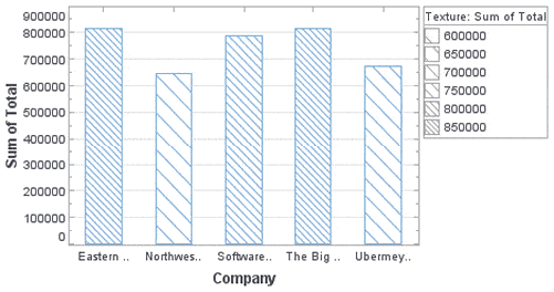
Color blind readability.
Support background textures on solid color UI elements like Pie and Bar charts.
Ideal solution would be angled lines in the charts for example http://www.inetsoft.com/images/screenshots/controlling_texture_in_a_bar_chart.gif
27 votes -
Pie label distance as percentage of pie size
Allow percentage value for option dataLabels.distance (percentage of the pie radius). That way I can make sure that the labels fit inside their slice for every label length and pie size.
http://jsfiddle.net/kzoon/ntDX9/ shows what I mean. If you use distance -30 longer datalabels go outside their slide. If you use -50 they fit, but that will mess up small pies (100px).27 votes -
Activity gauge - gradient with animation
Hi All,
I'm making a dashboard using Activity Gauge (http://www.highcharts.com/demo/gauge-activity) to show data.
I need to make it with gradient effect like darker to lighter which seems not possible with linear or radial gradient logically it seems not possible.
some how I have written an script with the help of support guy but seems not perfect solution as it do not have good visualisation and performance on browsers (very slower to load) see my samples -
http://jsfiddle.net/td2v4u4z/47/
http://jsfiddle.net/td2v4u4z/48/
http://jsfiddle.net/td2v4u4z/52/I need charts with more sharp lines and clean curves like http://www.highcharts.com/demo/gauge-activity
Can any one suggest me the perfect…
27 votes -
Vertical scrollablePlotArea for HighStock Across Y axises
On plotting multiple y Axis-es that are not opposite to each other.
There would be a need to scroll down to see the common X Axis and the navigator
This would provide a feel of floating X Axis and the navigator
Below is the example of my JS fiddle
https://jsfiddle.net/ynfbcxzo/
Detailed discussion on the same could be found in the below thread:
27 votes -
Dependency wheel labels orientation
can we have Dependency wheel labels orientation like below attached like
https://www.highcharts.com/forum/viewtopic.php?p=151318#p151318
27 votes -
Better Performance - Provide jqmobi (Intel AppFramework) adapter
Problems:
1. Highcharts is awesome, but consumes too much of resources on less performant systems
2. jQMobi is fast, building Apps with jQUI a joy, but getting it to live in harmony with Highcharts + jQuery on the same page can become quite a hassle and re-introduces the (comparably slow) jQuery into your app.Having a jqmobi adapter would be great.
See https://github.com/01org/appframework for jqmobi reference and code.
26 votes -
Ability to write the labels of the sunburst chart on an arc (and multiple lines) per element
Ability to write the labels of the sunburst chart on an arc (and multiple lines) per element. See https://forum.highcharts.com/posting.php?mode=reply&f=9&t=40715&sid=28efe43f1c03f9537e7c32ac6de94d06
26 votes -
Dynamic histogram charts
I would love to see interactive histogram charts. Ideally I would pass a single series of data to the chart, along with a default number of bins. Then the user would be able to change the number of bins and the data would be re-binned and the chart re-drawn. Bin labels would be need to be regenerated automatically as well, either from the range of each bin, or its center-point.
An example:
Series: { data: [1,2,1,2,1,2,3,3,4,4,4,4,4] }
Histogram: { defaultBins: 2}would become:
xAxis: { Categories: [ "1-2", "3-4"] }
Series: { Date: [6, 7]}Then if the user changed…
25 votesSee our official histogram demo at http://www.highcharts.com/demo/combo-histogram
-
Bower Component
Please add a component.json and add Highcharts to the Bower registry.
http://twitter.github.com/bower/25 votes -
Color axis support for map with levels
Color axis support for map with levels
https://github.com/highslide-software/highcharts.com/issues/4551Even GeoMap needs same kind of support:
See below cateogy map demo of GeoMap
http://www.highcharts.com/maps/demo/category-mapHere using color intesityif want to show which area has more sale i cant do it easily.
25 votes -
Make axis labels formattable so that they all have the same number of decimal places
I would like to have all axis labels rendered with the same number of decimals. Currently, I can fix the number of decimals using the format string, but when zooming in, more decimals are often necessary.
In statistics, it is a general consensus to have axis labels with the same numebr of decimal places to indicate the precision level, so I suggest Highcharts to support this, too, without reverting to custom code.
Currently, it can apparently only be done using custom event code, see this Highcharts Forum entry:
https://forum.highcharts.com/highcharts-usage/how-to-have-all-yaxis-labels-show-same-number-of-decimals-t40826/Thanks for your consideration!
J.25 votes -
Ribbon Chart
A "ribbon chart" which is a new way to look at a stacked area/column chart. Looks much prettier and easier to compared to the normal stacked styles that have commonly existed in most chart systems.
This site wrote up an article about the style being added to another chart system.
http://radacad.com/ribbon-chart-is-the-next-generation-of-stacked-column-chart
thanks!
25 votes -
Mixing categories and subtasks in HighCharts Gantt?
Hello,
As I tried explaining here : https://stackoverflow.com/questions/54947746/mix-categories-and-subtasks-in-highcharts-gantt
I was wondering if, in Gantt, it was possible to use parent/subtask (folding and unfolding) while also having multiple tasks on a same "line" (mixing "Interactive gantt" demo with the "subtasks" one). Apparently it is not and so I'm wondering if this behavior can be expected in the future.
For now, I think I will use css classes (or another way of identifying the parents/children) to add a bold + folding icon to parents, and to .hide() the depending yAxis when clicked (that means having an event on the label, but I'm…
25 votes -
add category label mouse events
Events triggered when a user clicks/hovers/etc a category label (xAxis labels).
I would use this to provide more in depth information about the label clicked. For instance, charting years in xAxis, user clicks 2012, should bring up a menu with additional options for that year
24 votes -
x zoom for multiseries data
I have four series of data, and each series only has one data point. I would like to render these data with x-dimension zoom ability as good as 4 data points in one series. If this is a duplicate topic, I am really sorry, because I could not find a similar one.
Here is the fiddle: http://jsfiddle.net/yMSCZ/8/
I was trying to approach it by adding dummy x value to each data point from each series: http://jsfiddle.net/yMSCZ/9/ But it did not work out.
I understand in the first fiddle, HC will treat all the four points with the same x index,…
24 votesRegarding the OP, the recommended setup would be to use categories like this: http://jsfiddle.net/highcharts/yMSCZ/19/
- Don't see your idea?