1084 results found
-
Change adaptToUpdatedData value dynamically
We have a dynamic Dataset refreshing each 5 sec on the chart
like:http://jsfiddle.net/gh/get/jquery/1.9.1/highslide-software/highcharts.com/tree/master/samples/stock/demo/dynamic-update/
and we would like to Fetch ( async ) data when the user select a range in the middle of the chart. means the adaptToUpdatedData value passes from true to false. But right now to do so we need to re-create the chart with adaptToUpdatedData = false. like:
http://jsfiddle.net/gh/get/jquery/1.9.1/highslide-software/highcharts.com/tree/master/samples/stock/demo/lazy-loading/
Question is: Can we switch dynamically from real time (adaptToUpdatedData = true ) to fetch async (adaptToUpdatedData = false ) ?
And each time the cursor of the navigator is on the right side ( to see…4 votes -
Hide dataLabels when they cannot fit in column/bar
When you have a dataLabels displayed on bars/columns that are all low value and close to one another, the dataLabels become merged and unreadable.
I added some code in the alignDataLabel function that hides the dataLabel if it cannot fit inside the column/bar it is to be displayed in. When the column/bar size changes by either resizing the window or by turning off some series the dataLabel becomes visible, or invisible if made smaller.
Here is a gallery demonstrating the changes: http://imgur.com/a/Qn6ui
The changes are simply adding the following code to the alignDataLabel function:
…if ((point.series.options.stacking != null && point.series.options.type12 votes -
Automatic hiding of tooltips after delay (for iPhone)
The iPhone does not seem to register click events outside of the graph, and in some cases the tooltip will take up the entire graph / screen. I suggest to allow the option of a delay after which the tooltip will disappear. We have already implemented this using private HighCharts methods, but it is not the right way of course.
3 votes -
Have Highstock series data be displayed as background color
I have multiple time series data which I would like to visualize together. One of this time series is state the device was in (up, down, booting, etc.) and I think the best way would be to simply map this state to a background color of a plot. So this should cover all the background and be zoomable and everything. It should be displayed in viewfinder/navigator.
7 votesYou can currently implement this as plot bands on the X axis.
-
hide all of the legend
hi, i was trying to hide the legend for a pie chart with a button using this example http://jsfiddle.net/sbochan/3Bh7b/1/ but i have a lot of items in my chart and i have to use the "navigation" option to display my legend items... but using that example, the arrows and the "legend page" number doesn't disappear...
3 votes -
Semi circle graphs
it would be nice to have semi circle graphs to show e.g professional experience duration (especially Year wise.) e.g a person works from 2008 to 2012 in a firm, there would be a semi circle with a Title of firm
1 voteWe just implemented this as a donut chart with a new option, endAngle. See http://jsfiddle.net/highcharts/d73bR/.
-
followPointer - tooltip should hide when it gets far away from the original data point
followPointer is a cool feature on a bubble chart, but it needs to close the tooltip when the pointer moves a fair distance away from the bubble, perhaps when it's something like half maxSize away. At the moment you can push the tooltip from one side of the chart to the other so the tooltip is out of context, which feels buggy.
For a demonstration, please see
youtube: http://www.youtube.com/watch?v=pgLNeDWeNTw
source: http://jsfiddle.net/franzo/WS6hY/4 votes -
add "after tooltip show" event
I want to do something after the tooltip shows.
And I found the "point hover" eventBut when I use the "crosshair" option, it doesn't need to hover the points to trigger the tooltip, anywhere of the chart triggers the tooltip
So now I can only do something when user's mouse hovers the points
I want to do it when the tooltip shows,
So i think it's better to add a "after tooltip show" event in options.
thanks
2 votesYou can use the internal chart.tooltipRefresh event: http://jsfiddle.net/highcharts/Ym4UA/
-
Reverse order in stacked charts
The current logic for the "normal" stacking is that the series are stacked from the top to the bottom. There should be an easy way to reverse the order, our users are used to build the stack from the bottom to the top and not vice versa. I suggest adding something like plotOptions { stackingOrder: 'reversed' }// default 'normal'
18 votes -
Start the animation when the chart scrolls in to view
I'd like to be able to delay the initial animation of the chart until it comes in to view in the browser by scrolling.
I've tried doing this with js but the whole chart is hidden until it comes in to view which looks odd. I'd like the axis to show and only the animation to trigger when it comes in to view.
7 votesHere’s a plugin/study for the feature: https://jsfiddle.net/gh/get/library/pure/highcharts/highcharts/tree/master/samples/highcharts/studies/appear/
-
support more or custom spline fit algorithms
As mention in the comments for "Fix spline plots" (http://highcharts.uservoice.com/forums/55896-general/suggestions/871839-fix-spline-plots-to-draw-a-better-generalized-line), sometimes the built in spline fit method is not acceptable. It would be great if there were other fit options built in (like D3: https://github.com/mbostock/d3/wiki/SVG-Shapes#path-data-generators) or allow custom algorithm to be plugged in.
0 votesActually there is such a method, getPointSpline. It computes the line segment from one point to the next. It takes arguments for the whole segment, the point and the index, so you can add the surrounding points to the calculation as well. See http://jsfiddle.net/highcharts/6sQjJ/.
-
Fill area range under spline
The features we need to apply is fill area under spline.
The common solution on your forums suggest holding another series with type ‘areaspline’
and give it the corresponded points we have 2 problems with this :1) We are holding huge amount of data on real time updating timeline and we don’t want to hold another series
with the same points count (even if the most of them are null) just for color small area from time to time2) The ‘areasplin’ does not correspond the ‘spline’ Bezier curve it exceed from its frame as showing below
current workaround…
7 votes -
how to add scroll bar for legend in pie chart
My legend is to long and is moving out of the legend box. it would be nice to have a scroll bar for the legends,
3 votes -
4 votes
-
ignore series for axis scaling
like to be able to tie a series to an axis for display but have it ignored for scaling as long as there is another series available to that axis for scaling.
Series : [ ignoreForScaling : Default false] or maybe
Series : xAxis|yAxis : [ignoreForScaling :Default false]5 votes -
Doughnut chart with KPI in middle
Like in http://www.improving-visualisation.org/vis/id=348 I want to add 1 (not 2 as in the example) number in the middle of the doughnut. Is that possible?
3 votesOne possibility is to put the chart title in the middle: http://jsfiddle.net/highcharts/6MbWd/
-
Will you plan support the connectors between bubbles?
Will you plan support the connectors between bubbles
( http://www.highcharts.com/demo/bubble)
since the connection between bubbles can express the figures more details.1 vote -
Dotted line between points with null breaks in between
A feature that adds a dotted line instead of a solid line
between two points when connectNulls = trueEx.
x - y
1 - 2
2 - 3
3 - NULL
4 - NULL
5 - 3Would be a solid line except between 2 and 5 where it could be dashed
11 votes -
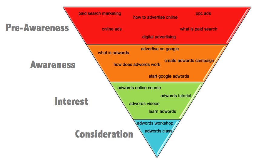
Funnel with fixed height
It would be nice to have an option for the funnel to set a fixed height for each row.
I'm thinking of an separate array with percents. So you can make a upside down pyramid like this:
http://www.searchenginejournal.com/wp-content/uploads/2013/03/image00113.pngSo you set a height for the chart and the config would be [25,25,25,25]
7 votes -
Pass the number of nulls instead of true/false to dataGrouping approximation functions
I would like my chart to sum or average points in dataGrouping but only when the most of the points are non-null. e.g. When more than 90% of the data is non-null, then show the sum/average, otherwise show null.
Currently, the data passed to custom aggregate functions only contains the number of non-null points and whether or not their are any nulls. There is not enough information to judge what percentage of the period of time is missing data. This could be easily improved by just passing an integer instead of a boolean for hasNulls. hasNulls could be 0 (or…
3 votes
- Don't see your idea?