1084 results found
-
In Gantt, provide ability to set multiple rows for the same category
The use case here is to allow rendering multiple tasks (or date range data) that might be overlapping by switching them to different rows within the same category.
An SO question was asked in this regard: https://stackoverflow.com/questions/55624319/highchart-gantt-chart-no-overlapping but it appears that the provided solution can't be generalized, see this other SO question: https://stackoverflow.com/questions/59809680/highcharts-gantt-avoid-overlapping-tasks/59824943?noredirect=1#comment105857552_59824943
I think that being able to provide data in a format similar to the first SO question, that is to specify a y value or other value to represent the category row index is a good solution.
As a side note, I posted another SO question (…
1 vote -
Pro / Contra Bar chart
Bar chart showing Pros to the left, Contras to the right and in between the items as text .
See png example here:
1 vote -
Is there any highchart with c # code?
Is there any highchart with c # code?
1 vote -
step line without vertical lines
Step line connects data with vertical lines. In order to visualize climatological norm values being able to simply depict a horizontal line for one data point would be handy. Could be realized with a step line chart that hides vertical lines.
0 votes -
VennDiagram
I need no default datalabel for venndiagram. Kindly reply with solution as early as possible.
1 vote -
table chart in drilldown levels
when i click the bar it goes to second level in second level i have to shown a table chart
6 votes -
highstock Measure min-max performance
Hallo team, in highstock you have "measure" feature that give me MIN,MAX,AVERAGE,BINS.
Would me more interesting for stock chart to have % difference from min to max or max to min if i measure downward.
is very simple calculation, could you maybe evauate this?i ask to have:
MIN
MAX
AVG
BINS
%+ (or %-)vould be also great if measurement feature will have magnet that can be anchor to min/max.
Is not possible to load here one picture, but i hope you understood well. I also opened ticket with picture: #2116 Measure GUI
1 vote -
Legend spacing
Hi,
I've few concern about legends.
For legend size, you have 2 property,
1) width
We can set width as pixel (or) percentage.
2) maxHeight
We can set maxHeight of legend as pixel.
Now, check the example below,
https://jsfiddle.net/nubr17ty/1
Setting width as percentage (30%) helps the chart to have enough space for plot area.
But look at the example below,
https://jsfiddle.net/nubr17ty/2
Here unnecessarily legends are occupying 30% of space as the legend name is very small.
1) Do you have any property to set maxWidth (as you have maxHeight) ?
If we set the maxWidth, we can solve the above…1 vote -
Provision for common axis options
Hi,
It would be useful to have a way to provide options that are common for all (y)Axes similar to how it is available for https://api.highcharts.com/highcharts/c ... rallelAxes. For example, provide a way to specify showLastLabel as common for both the Y axes in https://jsfiddle.net/8ax6uoed/. This can be seen as similar to how series options have multiple level of abstractions.
Thanks,
Krishna1 vote -
Vertical scrollablePlotArea for HighStock Across Y axises
On plotting multiple y Axis-es that are not opposite to each other.
There would be a need to scroll down to see the common X Axis and the navigator
This would provide a feel of floating X Axis and the navigator
Below is the example of my JS fiddle
https://jsfiddle.net/ynfbcxzo/
Detailed discussion on the same could be found in the below thread:
27 votes -
Timeline chart
Can we change linecolor for timeline chart from specific Point
1 vote -
bignumber highcharts
Possibility to use Highcharts with bignumber.js
12 votes -
Gantt new feature request change places of rows by dragging
Gantt new feature request change places of rows by dragging
With the new feature the user shall be able to change places of the complete rows by dragging in charts with parent (below example)
Today not supported in any chart but we need it with parent. Or if this is not possible at least draggableY: true should work for parent charts so that you can write this functionality yourself using the drag event. This is a basic feature in any gantt.
Example Chart where this should be implemented
https://jsfiddle.net/JohanBrodin/Loq38vk4/3 votes -
Speedometer ++
Inspired in the car speedometer, adding the mileage and a date and time display would be incredible, because you can transmit in just one piece: The mileage (or any accumulated value), the speed (or the rate of variation), and the time and date.
You can create incredible animation effects where like in climate change you can transmit the co2 level in ppm (mileage), the yearly increase in ppm (speed) and the date and time gives you the last time the value was measured, or if you run the animation you can see the perspective of say the last 50 years…1 vote -
speed calculation in time graph
It would be very useful to calculate the speed of change in the y axis at every point in the time series. Something like this:
chart.series[0].points[0].y.speed(year)speed(Year) would calculate the rate of change per year, or month or day of the Yaxis variable,
you could also implement acceleration
chart.series[0].points[0].y.acceleration(year)1 vote -
Multidimensional 3D data cubes chart?
Is there a way in Highcharts to draw multidimensional data cubes?
If Yes. Please let me know1 vote -
New pattern need to be created from the parent circle patterns for intersected data
Hi
New pattern need to be created from the parent circle patterns for intersected data .
Example: If one of the parent circle has vertical line pattern and other parent circle has horizontal line pattern, the intersected part should have pattern that must be the result of both parent circle. In this case it should look like square box (combination of vertical and horizontal circles).1 vote -
can we allow Heatmap Zones to respect colors from colorAxis?
I have a requirement for heatmaps which involves applying a patternObject as a color for zones applied to the x-axis, but I also need the pattern fill to respect the color applied by the colorAxis.dataClasses. Is there currently a way to do this that doesn't involve applying classNames in styled mode?
1 vote -
your map is very old some place are not add eg:in india add telugana and some other state and in this problem many country so update
your map is very old some place are not add eg:in india add telugana and some other state and in this problem many country so update
1 vote -
enable resize option for annotation labels shape
Expected behaviour
Currently we have annotations label shapes are like this
Actual behaviour
I need the annotations labels to respond to resize option , that html provides like this
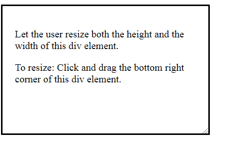Could you please help out in achieving this ?
2 votes
- Don't see your idea?