1075 results found
-
speed calculation in time graph
It would be very useful to calculate the speed of change in the y axis at every point in the time series. Something like this:
chart.series[0].points[0].y.speed(year)speed(Year) would calculate the rate of change per year, or month or day of the Yaxis variable,
you could also implement acceleration
chart.series[0].points[0].y.acceleration(year)1 vote -
Speedometer ++
Inspired in the car speedometer, adding the mileage and a date and time display would be incredible, because you can transmit in just one piece: The mileage (or any accumulated value), the speed (or the rate of variation), and the time and date.
You can create incredible animation effects where like in climate change you can transmit the co2 level in ppm (mileage), the yearly increase in ppm (speed) and the date and time gives you the last time the value was measured, or if you run the animation you can see the perspective of say the last 50 years…1 vote -
Vector color on a vector map
At this time, in a vector map, all de vectors have the same color. If the direction of the vectors can be classified, we can assign a color to each class and each vector in the class will have the same color. In this way, trend zones (identified by color) will be formed, if they exist.
We need to be able to define, for each vector, its personal color.
Regards,
Antoni.Exemple:
https://www.dplot.com/help/index.htm?helpid_vectors.htmhttps://climatedataguide.ucar.edu/climate-data/quikscat-near-sea-surface-wind-speed-and-direction
1 vote -
Provision for common axis options
Hi,
It would be useful to have a way to provide options that are common for all (y)Axes similar to how it is available for https://api.highcharts.com/highcharts/c ... rallelAxes. For example, provide a way to specify showLastLabel as common for both the Y axes in https://jsfiddle.net/8ax6uoed/. This can be seen as similar to how series options have multiple level of abstractions.
Thanks,
Krishna1 vote -
Flexible to edit Plot Area
Hi,
Providing full flexibility to edit plot area size to render the chart with the desired space. Have attached the Video in the below thread
https://support.highcharts.com/support/tickets/4299Regards,
Santhosh.1 vote Kacper Madej
responded
Kacper Madej
responded
To edit plot area size you could use margin and spacing options of a chart.
API reference:
https://api.highcharts.com/highcharts/chart.margin
https://api.highcharts.com/highcharts/chart.spacingThere is no GUI for those changes or drag and drop on the plot area.
The closest thing is Axis resizer: https://www.highcharts.com/docs/advanced-chart-features/axis-resizer
Demo for vertical resizing (using API options): https://jsfiddle.net/BlackLabel/q1z4voxb/10/ -
Legend spacing
Hi,
I've few concern about legends.
For legend size, you have 2 property,
1) width
We can set width as pixel (or) percentage.
2) maxHeight
We can set maxHeight of legend as pixel.
Now, check the example below,
https://jsfiddle.net/nubr17ty/1
Setting width as percentage (30%) helps the chart to have enough space for plot area.
But look at the example below,
https://jsfiddle.net/nubr17ty/2
Here unnecessarily legends are occupying 30% of space as the legend name is very small.
1) Do you have any property to set maxWidth (as you have maxHeight) ?
If we set the maxWidth, we can solve the above…1 vote -
Is there any highchart with c # code?
Is there any highchart with c # code?
1 vote -
In Gantt, provide ability to set multiple rows for the same category
The use case here is to allow rendering multiple tasks (or date range data) that might be overlapping by switching them to different rows within the same category.
An SO question was asked in this regard: https://stackoverflow.com/questions/55624319/highchart-gantt-chart-no-overlapping but it appears that the provided solution can't be generalized, see this other SO question: https://stackoverflow.com/questions/59809680/highcharts-gantt-avoid-overlapping-tasks/59824943?noredirect=1#comment105857552_59824943
I think that being able to provide data in a format similar to the first SO question, that is to specify a y value or other value to represent the category row index is a good solution.
As a side note, I posted another SO question (…
1 vote -
group multiple series for slicing in variablepie
When you want to slice multiple series in a variablepie chart they are sliced all individually. It would be helpful, if you could group them so they all slice into the same "ring"
For further description see this post: https://www.highcharts.com/forum/viewtopic.php?f=9&t=43283&p=152632#p152632
1 vote -
Updated India Map
Jammu and Kashmir , Ladakh has seperated in India. But in highcharts only the old map is there. Please update the map. If so the updated map exists , Please tell us
1 vote -
Name of departements in the geojson file
Hello, can you change the č for è in the maps for Country France all-all ? I changed it in an new file, but can't use the cdn file.
Thanks
1 vote -
Add ability to show Global Level Data on HighMaps
HighMap is great for showing/comparing national data: https://www.highcharts.com/maps/demo/rich-info
But would be great to ALSO display World-level data ie add a place to click on the global map to display eg Global Total Population in the side chart - it would be great to be able to co-plot this World Total alongside individual countries for comparative reasons1 vote -
navigator
Stock navigator only accepts date and time as xaxis. Can it accept any data as xaxis, for example, depth in meter?
James Zhao
1 vote -
Browser change of font size
When changing the browser font size the change should be reflected on the Graphs to meet WCAG C14. https://www.w3.org/TR/WCAG20-TECHS/C14.html
1 vote -
Chart Cursor - vertical line with tooltips
Is it possible to add support for a chart cursor, a vertical line following the mouse which shows the tooltips for multiple series.
This should also work with zooming.
Amcharts has support for this feature, would be nice to have it in Highcharts as well.
https://www.amcharts.com/docs/v4/concepts/chart-cursor/1 vote -
heatmap active selection
The Heatmap doesn't depict the user selection, nor does it behave like all the other charts. For consistency we need the heatmap to allow for active selection and show what the user selected
1 vote -
Highstock for R
I suggest that should be able highstock to use in R, ether in the highcharter package or in a new one. Furthermore it could be realize tu use with different class objects like data frames, xts and zoo
1 vote -
solid gauge rounded edges
I am using solid gauge, shape 'arc'. I am trying to show round edges, on both sides. Seems like it only rounded the edge on the left, but not right.
Basically, also round the gray edge, too
1 vote -
Boxplot zones using median as threshold
For boxplot chart, when setting zones, highcharts uses the high value as threshold.
It could be great to be able to configure highchart to use a different value (median for example)1 vote -
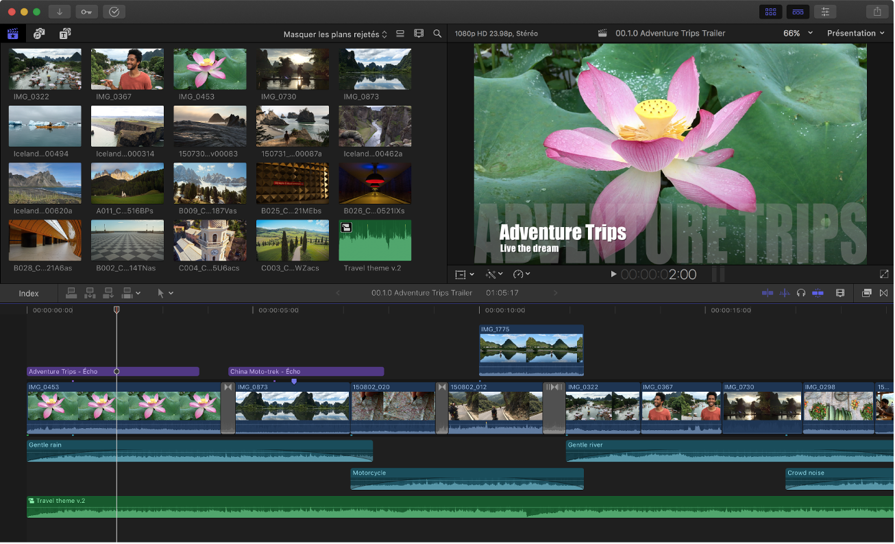
Gantt Player bar
Hello,
A good feature for the gantt will be a player bar like you can see video editor (https://help.apple.com/assets/5B906E570946222769C59847/5B907055680CE21E1ABD0FFD/fr_FR/3586832deaa5d73c6ad2aca436e25c0d.png ).
Thank you
1 vote
- Don't see your idea?