1084 results found
-
5 votes
-
Stacked area (spline etc) in irregular datetime series
When you create more datetime irregular series, by now only the same datetime values are used to create the stack, resulting in a correct-but-ugly graph.
327 votesWe have done improvements in this behaviour in Highcharts 3.0. See http://jsfiddle.net/highcharts/QuteB/. Would you consider this case solved?
-
Add mouse events for chart axes
I need to be able to capture mouse events on axes - primarily hover (mouseenter/mouseleave) and click - so that I can expose axis options in a user friendly way.
I suggest adding these events to the axis definition, much the same way that series and points are done. Also need to be able to identify which axis was clicked (just the id is fine)
14 votes -
Option for tooltip to follow mouse cursor (height-wise)
Hello,
I've made some research and haven't found any option for tooltip to follow mouse cursor (height-wise). It would be one useful option if a series contains a lot of peaks and spikes or there are two series which values are very different and samples aren't aligned (time-wise). It could give one much smoother experience.
17 votes -
Trigger event when hover the mouse over the chart.
Trigger an event with X,Y.. when hovering the mouse over the chart.
2 votes -
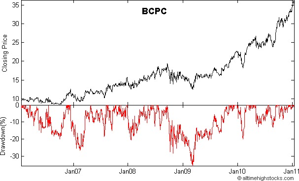
Add drawdown line (including calculation)
When assesing alogrithmic stock exchange strategies a common factor to look at is the drawdown. This is the line which calculates worst case scenarios. See an example here (the line below): http://1.bp.blogspot.com/_BfLmdGI0L-U/TTM1v0-cBMI/AAAAAAAAAgQ/5x_T8pmcCZE/s1600/BCPC-Balchem-Corp-NASDAQ-Drawdown-Stock-Chart_20110116T131301.bmp
3 votes -
Adapt chart height to legend height
Auto sized (height) "renderTo" container on bottom aligned legendgroup with fixed chart height + option for legend items with the same (max) width for better readability
298 votesThere’s a plugin for this, please see http://www.highcharts.com/plugin-registry/single/8/Adapt-Chart-To-Legend
-
Set Axis's top and height at runtime
In order to display two panes (price pane at top and volume pane at bottom) correctly when chart's container resizing, it would allow to set axis's top and height at runtime.
Or another way you can do is to set axis's top and height value in percentage unit.
42 votesHere’s a small plugin that allows setting axis top and height as a percentage: http://jsfiddle.net/highcharts/D6TvE/
-
Allow users to hit Enter to change date/time range
Currently in Highstock, if you're editing the date/time range by using the text fields, you can't hit Enter to make your changes, which is odd. Instead, you have to click the page outside of the text field. Support for hitting Enter should be added.
0 votesWe currently use the input box’s onchange event. Turns out that Chrome and Firefox already trigger the event on Enter. IE8 however fails to change the ranges on Enter.
-
Allow specification of indices for series from one data array
I have data that is 10's of thousands of points per chart, so the named value pair form of the chart won't work. So I'd like to request a new feature. Where you let me use 1 or 2 indexes into the point data to define a series, but allow me to access all of the data from the tooltip. So for a line chart I would define the series by the array name, and 1 index and for a scatter chart I would define the series by the array name and 2 indices. But the this.point would refer to…
1 voteI’m not sure I get you, but perhaps you can solve your task by using parallel arrays? http://jsfiddle.net/highcharts/uBVzY/
-
"Inverse" step line option
Current step line chart plots the horizontal line first, then the vertical. "Inverse" option would result in the vertical line plotted first, followed by the vertical.
10 votes -
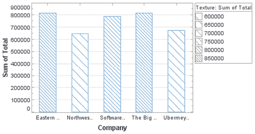
Color blind readability.
Support background textures on solid color UI elements like Pie and Bar charts.
Ideal solution would be angled lines in the charts for example http://www.inetsoft.com/images/screenshots/controlling_texture_in_a_bar_chart.gif
27 votes -
Theme Creator
A theme creator for different styles of the library would be nice.
34 votes -
Conditional Colors Minimum Maximum
Example: 20 shops with the same 20 products, 3D bar charts, lowest price per product green, highest price per product red, others default color, e.g. grey
Result: which shops have lowest prices.
It should be possible that minimum and maximum can have a range (e.g. +- 3 %) to have the green or red color.
1 vote -
Theme option in chart options or constructor
Theme being a global object (Highcharts.theme = {...}) is quite limiting - we have some cases where we want to have multiple charts on 1 page but with different themes.
To do that now we have to intersperse all the theming options with the rest of the options, which works, but is somewhat clunky. Or we can set the theme, render 1, set the theme, render another and hope there are no redraws required.
This suggestion is about adding a theme argument either to the highcharts options object, or to the constructor. eg:
new Highcharts.chart({
theme: {...},
chart: {...},
series:…3 votesThe theme actually isn’t part of the Highcharts namespace internally, it is just assigned there for conveniency.
Best practice currently would be to merge in the theme with your chart options:
chart1 = new Highcharts.Chart(Highcharts.merge(options1, theme1));
-
3 votes
-
mark type 'x' and '+'
like this http://jpgraph.net/download/manuals/classref/PlotMark.html all types of mark
3 votesYou can add that as a plugin without altering the source code. See http://jsfiddle.net/highcharts/bz2pd/.
-
Allow styling of "reset zoom" link
Users often overlook the link and cannot reset the zoom level.
17 votes -
33 votes
-
Tooltip delay
I would like the tooltip to have a 'initial delay' - such that it acts more like a typical tooltip. I.e. the tooltip only shows after the mouse is stationary for a specified time, and then tracks data points instantly once shown.
Additionally, I would like the tooltip to be able to be replaced by a callback which provided the point values, such that they could be displayed elsewhere. So, for example, I might want to display the values of the currently tracked points in a div to the right of the graph, while still retaining the crosshair functionality.
22 votesHere’s a snippet that adds an optional delay to the initial tooltip display: http://jsfiddle.net/highcharts/xb4ax7v0/
Does this fix your problem?
- Don't see your idea?