1084 results found
-
Multiple dimensions on 2D chart
Most people use the 2D charts with 2 variables only. But with the advance in data analytics 2 variables on the same charts are no longer enough. We need to be able to display multi dimension on 2D charts. Few ways to achieve this are:
* Allowing the size of the markers to change to based on a third dimension
* Allowing color of the markers or lines to change based on a 3rd dimension
* Allowing shape of the markers to change based on a third dimension.If we apply all the options above we should be able to…
4 votes -
Sankey Chart Enhancement: Labels for Axis
It would be great if there were a feature to add axis labels to the existing Sankey chart at each level. Something like this: https://i.stack.imgur.com/cYsNT.png
I notice that this has been previously mentioned in the Sankey Diagram thread (https://jsfiddle.net/7aa18mws/). However, in-built support for this on multiple levels would be great.
8 votesThans for your suggestion! For the records, in the internal terminology this would be labels for the columns.
-
4 votes
-
Accept chart settings and data and return a PNG of the chart
Create a service similar to https://pdfcrowd.com/.
Create an API endpoint that can convert settings into a file format (PNG) that is charged either per conversion or annually.
The API would take our chart settings and chart data, plot the chart on your server side and return to the client a PNG (or other supported file types) of the chart we requested.
4 votesThank you for your suggestion!
Currently, you can use our public export server to do this. It runs at https://export.highcharts.com and accepts parateters as described at https://www.npmjs.com/package/highcharts-export-server.
There is however a limitation of 10 charts a minute. We are considering setting up a commercial service to allow more conversions.
-
linechart symbol markers at the end of each line
At SSB we have a lot of auto generated charts, and need symbol markers on charts to fulfill accessibility requirements, but on a lot of our linecharts the point density is so great that the chart becomes unreadable, but not dense enough for the "null" option to kick in and remove the markers.
Therefor, what we need is that marker symbols appear at the end of each line, while also appearing at the corresponding legend.
(We tried a solution that was posted in another feature request, but found no way to implement it with auto generated charts and also it…
3 votesI have implemented a new option, enabledThreshold. Now we can explicitly add a marker to the last data point to achieve the required effect: http://jsfiddle.net/highcharts/sj167xkm/
-
Option to export PDF to dataUri string instead of downloading
It would be nice to have an option to export chart (as PDF) to datauri string instead of file.
This can be done now indirectly, by obtaining chart's underlying svg, calling svg2pdf and finally using jsPDF doc.output('datauristring')
[which returns the base64 dataUri] instead of downloading file.Maybe as an option in 'exporting' object?
Or by exposing new method, i.e. Highcharts.exportToUri() ?Or maybe there's some simpler way that I am not aware of?
Thank you.2 votesThank you for your request! By extension, this applies to PNG and JPEG exports in addition to PDF. You can override the Highcharts.downloadURL function to capture the dataURI. See http://jsfiddle.net/highcharts/9my975x4/.
-
crosshair label shape
Can we make the crosshair label shape like blow image http://i.imgur.com/5fBPnFs.jpg
1 vote -
add a `dashStyle` that can show the direction the line is going
When showing a line on scatter chart it can be hard to tell where the line started and where it ended.
Having a dashStyle option that was similar to plotOptions.scatter.dashStyle = 'dot' except that instead of a dot it was a rotated triangle that pointed in the direction the line was going would be awesome.
I saw some hacks for turning the entire line into one long arrow but that isn't what I was looking for.
1 voteA possible way to do it is to use SVG markers, see http://jsfiddle.net/4qgy4rmh/1/.
-
Natively support linked series to 'act as one' when the series legend title is hovered over
When two or more series are linked, only the first series (the one with the 'id') gets selected when the linked series legend entry os hovered over.
The other series linked to the first series are dimmed like all other (ie. non linked) series.
It would be nice if by setting a flag, each linked series would act the same as the first series when hovering on the legend entry.
See this for an example of what I mean:
https://jsfiddle.net/daniel_s/1hL6saxn/The above proposed solution is overly complex and convoluted, a native solution would be much cleaner.
Why not something like:
1 vote -
make Highcharts wrapper compatible with crosstalk R pkg
Crosswalk makes two way communication between html widgets possible. Only seen shiny do one way comms. https://rstudio.github.io/crosstalk/index.html
5 votes -
Provide pointWidth as a percent value
Consider the scenario that there is a re-sizable box plot chart. When the chart is reduced to a smaller size, box plots start overlapping because pointWidth can only be given in pixels. And when the chart is enlarged, box plots are seen to be smaller with respect to chart size. The same goes for column charts, etc.
So, there should be a feature where we can provide percentage values for pointWidth.
13 votesI don’t really think this is needed, please correct me if I’m wrong. Instead of using pointWidth, you can control the width by using pointPadding, which is relative. The pointPadding option allows you to pack the boxes tightly, with a 50% gap or whatever, and it will respond to different chart widths.
-
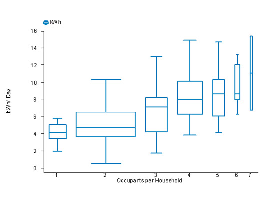
Variable widths for Box Plots
Variable widths for box plots is a popular convention (see https://en.wikipedia.org/wiki/Box_plot#Variations). Variable width box plots illustrate the size of each group whose data is being plotted by making the width of the box proportional to the size of the group. For example:
http://www.fsec.ucf.edu/en/publications/html/FSEC-PF-369-02/images/pf369-10a.jpgSo, there should be a way to provide pointWidth for each data point of box plot. Also, this feature should work seamlessly with multiple series.
Issue has already been filed to Github: https://github.com/highcharts/highcharts/issues/5441
24 votes -
Official Vue.js Wrapper
Hi, It's excited to hear that you are created Highcharts official React, Angular wrapper, and do you have any plan to create Vue.js Wrapper ?
more information about Vue.js
Official Website: https://www.vuejs.com
vue Highcharts wrapper : https://github.com/weizhenye/vue-highchart12 votesThanks for your request! Currently we don’t have a plan for a Vue wrapper, but we will consider this if the demand is high.
-
Add "Xaisomboun Province" to Laos map in Highmaps
Hi,
I would like to add "Xaisomboun Province" refer to this https://en.wikipedia.org/wiki/Provinces_of_Laos, because "Xaisomboun Province" next to "Vientiane Province" is missing from the original map in Highcharts demo. Here: https://www.highcharts.com/maps/demo/all-maps#countries/la/la-all
How can i update this in the original official JS file. Here: https://code.highcharts.com/mapdata/countries/la/la-all.js
I try to use this tool https://www.highcharts.com/studies/map-from-svg.htm but it does not output data format like in the original javascript file above.
Best Regards,
Phouvanh1 vote -
highcharts area range and line with gradient
I would like to have a gradient fill for area range graphs where the color starts at the center of the area and then fades to the secodn color at the edge of the range.
Similar to this question on stackoverflow: https://stackoverflow.com/questions/14781214/highchart-area-range-chart-with-gradient-that-follows-the-line#
6 votes -
Sunburst chart: Option to show series data labels outside the leaf level nodes with connectors
Currently, it is observed that Sunburst chart series data labels when shown, overlap or only the show/hide behavior of data labels can be achieved through the formatter function.
Refer the Sunburst chart's series data labels on the following link:- http://www.dundas.com/support/blog/sunburst-charts-homerun-or-groundout
Expected behavior is to configure the series data labels in such a way that if the arc size of a node is less than a particular value, instead of hiding the data label, show it outside the leaf level nodes of the chart, also adjust the distance of data labels and its connectors from the chart.
31 votes -
Plot Band can be divided into sub Band
Plot Band can be divided into sub Band. If this feature is provide then it will be easy to define Sub band in a plot band. Just like a stack bar diagaram
1 voteDo you mean that a plot band on the X axis can be limited to a certain Y range?
A possible hack to achieve this would be to use a polygon series: http://jsfiddle.net/highcharts/2c97sc5r/
-
Creating Italy's regions as done for German and France
Regions of Italy like France regions admin2 and German admin 2 are missing. Would be a great idea having those as well. Thanks in advance
1 vote -
Make it possible to group and style individual legend items
Over time my legend has gotten really crowded and i would like to be able to first: group my items, and secondly: style them individually.
This would boost the usability enormously!
4 votes -
Highlight area under curve
I want to highlight a particular portion of Highchart.
Ex Image :https://www.screencast.com/t/MHxo59j2dM.
Zones, Threshold, negative color options provide in Highchart but Can we highlight with X and Y axis value ?1 vote
- Don't see your idea?