402 results found
-
confidence intervals / error bands
It would be so useful to have support for confidence intervals (error bands), as shown here: http://dygraphs.com/
Thank you!81 votesRange series are available as of Highcharts 2.3 and Highstock 1.2
-
Provide option to automatically wrap long labels
Wrap long text labels on axes.
There is a nice summary of the enhancement request here, http://highslide.com/forum/viewtopic.php?f=9&t=8380&p=39252&hilit=wrap#p39252
22 votes -
support transparent lines
I have two lines of data in a line graph that is very close in value with respect to the max and min. So close that the data lines overlay each other and I only get to see (and tooltips for) the 2nd rendered line. It would be nice if you could use transparent line in cases like this. Currently I see only a single line and two descriptions in the legend.
3 votesTransparent lines are already supported: http://jsfiddle.net/highcharts/kesck/
-
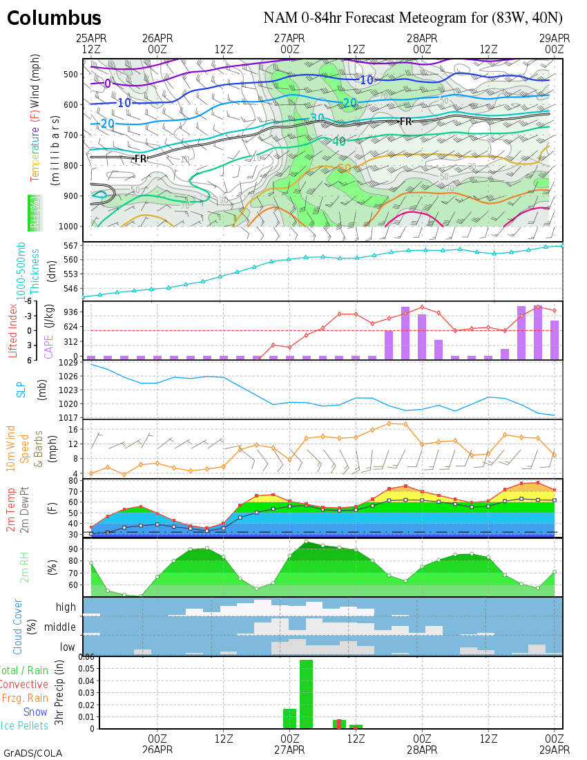
wind barb and vector plot
It would be very useful to be capable of plotting wind barb and vector arrow as a type of plot. This would allow us to plot 2 dimensional data (value, direction) alongside other line or column plots (i.e. temperature, pressure, etc.)
Example:
wind barb:
- http://weather.unisys.com/surface/meteogram/met_KBOS.gif
- http://wxmaps.org/pix/cmhnam.png
- http://www.meteoblue.com/public/fileadmin/meteoblue/pictures/Products/POINT_meteogram_day6_wind_080428.pngVector:
http://www.nortekusa.com/usa/library/images/duck-awac-8m-wave-vector-plot
http://www.marineweather.co.nz/forecasts/north-cape
- http://www.seabreeze.com.au/graphs/tasmania.asp34 votesWind barb is here:
https://www.highcharts.com/docs/chart-and-series-types/wind-barbs-seriesVector is here:
https://www.highcharts.com/docs/chart-and-series-types/vector-plot -
Specify a minimum unit for dateTimeLabelFormats
If you are charting daily data with a maxZoom of 7 days, the labels show as hourly. I'd like the ability to specify the minimum unit to display as a label for Specify a minimum unit for dateTimeLabelFormats (like days or weeks).
96 votes -
42 votes
Completed, see http://jsfiddle.net/highcharts/7CLjy/
-
40 votes
Implemented in Highcharts
- https://jsfiddle.net/gh/get/library/pure/highcharts/highcharts/tree/master/samples/highcharts/annotations/gui-buttons/
- https://jsfiddle.net/gh/get/library/pure/highcharts/highcharts/tree/master/samples/highcharts/annotations/gui/There’s a GUI to add/update/remove the annotations, and event handlers to connect to other actions.
-
provide multiple panes
have mutli pane charts like eg in financials stock charts you have price, volume, volatiility in 3 separate panes
10 votes -
support rtl
support languages that are written right to left like hebrew
57 votes -
115 votes
-
server side support
True server side or web services support so that I can post data and get a jpg back. I tried doing this my self with Rhino and env.js but didn't ever get it to work. The svg that was generated by High Charts had several issues that I have discussed on the forum
109 votes -
Scrolling legends
If the legend has more entries than fit on the screen it could create a scrollbar. This removes the burden from the developer to collapse all items after a given depth.
83 votes2012-05-15: Implemented scrolling legend: http://jsfiddle.net/highcharts/3Yd7B/
2011: I created the POC for using a HTML div for the legend items: http://jsfiddle.net/highcharts/nULxz/
For now it should be considered a hack. It has obvious weaknesses like unability to show marker symbols, and invisibility in export, but having a scrollbar in a static image doesn’t make much sense anyway.
Also the hack doesn’t reflect dynamic changes to the series of the chart.
-
Add style option to series data options
Allow series to be customizable through css classes. This would make it easier to customize the styling of a series, (ie. change the color) by changing values in a css class.
42 votesImplemented as of Highcharts 5.0.
See www.highcharts.com/docs/chart-design-and-style/style-by-css.
-
Setting opacity of scatter points too similar to area chart
When the number of points are huge its hard to view the overlapped points i think opacity feature will give a much clearer view.
2 votesIt is already implemented. When you set the color of the series to an rgba value, the points will be rendered transparent. See http://dev.highcharts.com/demo/?example=scatter&theme=default.
-
Automatic line break for title and legend labels
Currently titles are always rendered in one line. (Although it is possible to use a br Tag, but it is hard to calculate where to insert a br and the rest of the chart is not automatically shifted.)
It would be great to have an automatic line break for long titles and/or long legend labels and an auto shift of the other chart content.358 votesCompleted as of Highcharts 3.0.3. See http://jsfiddle.net/highcharts/NVmV5/
-
Allow specification of number of tickmarks
Allow option of specifying the number of tickmarks to display, rather than the range or interval of them.
29 votesThis was implemented as of Highcharts 5.0.
-
Add background options to datalabels
I am using a column chart in conjunction with a line chart. The problem is that the line intersects with datalabel of the column and makes it harder to read. See
http://i51.tinypic.com/34pj3tk.png
It would be great if I could add a white background color to the datalabel and increase its readability.
33 votes -
Add Step Property for X-Axis Grid Lines
For example if I use the "step" attribute to only show labels for the first day of each week, the chart still draws x-axis gridlines for each datapoint instead of where the labels occur. It would be nice to have separate step property specifically for the x-axis gridlines. This is useful if you want to break up the data into weeks or months and allow the gridlines to serve as indicators of where these blocks occur (i.e. a grid line only at the start of the week or month, etc.).
Example:
xAxisGridLineStep = 70 votesThis was completed in 2.1 using TickInterval.
-
120 votes
Implemented as of Highcharts 4.1 and Highstock 2.1. See http://api.highcharts.com/highcharts#xAxis.breaks and http://api.highcharts.com/highstock#xAxis.breaks
-
3 votes
Use a subtitle. See http://jsfiddle.net/sGv32/5/.
- Don't see your idea?